Pantone and CMYK can both produce excellent packaging, but they solve different printing problems. CMYK builds colours from cyan, magenta, yellow and black, while Pantone uses predefined spot colours for greater control over specific brand shades.
Neither system guarantees that a colour seen on a screen will look identical on every printed material. Paper stock, coatings, ink, printing method and lighting can all influence the final result.
Quick Answer: Choose CMYK for detailed, multi-colour artwork and photographic designs. Choose Pantone when a specific brand colour needs tighter print consistency. Some packaging projects use both.
Stop Colour Surprises: Why Perfect Matching Matters
Colour is often one of the first things customers recognise about packaging.
If the same brand blue appears dark on one carton and noticeably lighter on another, the packaging can feel inconsistent even when the structure and print quality are good.
The challenge is that colour is affected by more than the artwork file.
Results can change depending on:
- paper colour;
- coated or uncoated stock;
- ink absorption;
- surface finish;
- printing process; and
- viewing conditions.
For that reason, professional colour matching is about controlled consistency, not assuming every material will produce an identical result.
Understanding Colour Systems in Printing
Packaging artwork is commonly prepared using process colours, spot colours or a combination of both.
The two systems buyers encounter most often are CMYK and Pantone Matching System (PMS).
CMYK creates colours by layering printing inks.
Pantone normally specifies an individual ink formula for a particular colour reference.
Understanding this distinction helps brands choose a printing method based on the artwork rather than simply asking which system is “better”.
What Is CMYK?
CMYK stands for:
- Cyan
- Magenta
- Yellow
- Key (Black)
These four process inks are printed in different percentages to create a broad range of colours.
CMYK is particularly suitable for:
- photographs;
- gradients;
- illustrations;
- multi-colour graphics; and
- detailed packaging artwork.
It provides considerable creative flexibility, although some bright, metallic or highly specific colours fall outside the standard CMYK colour range.
What Is Pantone (PMS)?
Pantone Matching System, commonly called PMS, is a standardised colour reference system widely used in professional printing.
Instead of creating a colour only by combining CMYK percentages, a Pantone spot colour can be printed using a specifically formulated ink.
For example, a company with a carefully defined corporate blue may specify a Pantone reference so printers have a clearer physical colour target.
Pantone is especially useful for:
- logos;
- corporate colours;
- simple branded graphics;
- packaging requiring controlled colour consistency; and
- colours that are difficult to reproduce accurately with standard CMYK.
The chosen material still matters. The same ink can appear different on coated and uncoated surfaces.
Pantone vs CMYK – Key Differences
| Factor | CMYK | Pantone |
| Colour Method | Four process inks | Defined spot colour |
| Best For | Photos and multi-colour artwork | Specific brand colours |
| Colour Range | Broad process range | Extensive spot-colour library |
| Brand Consistency | Good with proper control | Greater control for defined shades |
| Artwork Complexity | Ideal for detailed designs | Best for selected colours |
| Special Colours | More limited | Includes specialist colour options |
The right choice depends on what the packaging artwork needs to achieve.
Why Your Packaging Colour is Non-Negotiable?
Colour builds visual recognition.
Customers may recognise a familiar shade before they read the logo or product name. Repeated colour differences across cartons, sleeves and retail packaging can therefore weaken brand consistency.
Accurate colour planning is especially important when packaging sits alongside:
- existing products;
- branded displays;
- labels;
- marketing materials; or
- previously printed packaging.
The objective should be to establish realistic colour standards before production begins.
When to Use CMYK Printing?
CMYK is generally the practical choice when packaging contains several colours or detailed artwork.
Consider CMYK for:
- photographic product images;
- illustrated packaging;
- gradients and shadows;
- complex patterns;
- colourful retail cartons; and
- designs containing many different tones.
It allows designers to reproduce complex artwork efficiently using the same four process inks.
For many everyday packaging designs, properly managed CMYK printing provides excellent results.
When to Use Pantone Printing?
Pantone becomes valuable when a particular colour carries strong brand importance.
It may be preferable for:
- logo colours;
- signature brand shades;
- minimalist packaging;
- one- or two-colour designs;
- difficult-to-reproduce hues; and
- projects requiring a defined physical colour reference.
A brand using a distinctive orange, blue or green across several packaging products may benefit from specifying a Pantone colour rather than relying only on visual CMYK matching.
Can You Mix Pantone and CMYK Printing?
Yes.
Some packaging artwork combines CMYK process printing with one or more Pantone spot colours.
For example, CMYK might reproduce a product photograph while a Pantone ink is reserved for the company logo.
This approach can provide both design flexibility and tighter control over an important brand shade.
However, additional spot colours can make production more complex, so they should be used where they provide a genuine visual or branding benefit.
How to Convert Pantone to CMYK (and Vice Versa)
Pantone and CMYK colours can be approximated between systems, but conversion should not be treated as an exact one-to-one translation.
A Pantone colour may sit outside the reproducible CMYK gamut. When converted, the resulting CMYK version may therefore look slightly different.
Likewise, a CMYK combination does not necessarily have an exact Pantone equivalent.
For important packaging colours:
- Start with the approved brand colour reference.
- Use recognised colour-conversion tools as a starting point.
- Check the result against physical colour references.
- Consider the intended paper or board.
- Review a suitable proof before production.
Avoid approving critical colour decisions from an uncalibrated monitor alone.
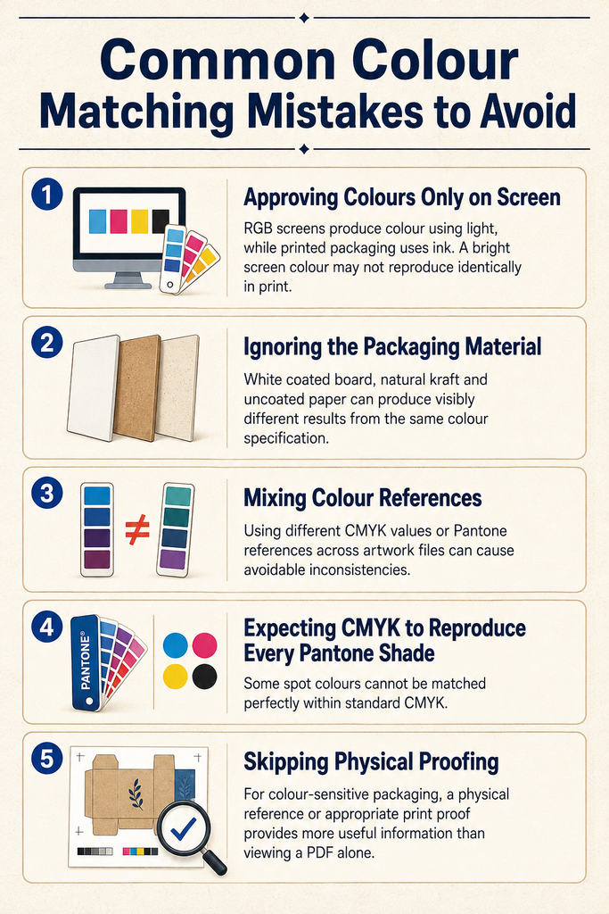
Common Colour Matching Mistakes to Avoid
Approving Colours Only on Screen
RGB screens produce colour using light, while printed packaging uses ink. A bright screen colour may not reproduce identically in print.
Ignoring the Packaging Material
White coated board, natural kraft and uncoated paper can produce visibly different results from the same colour specification.
Mixing Colour References
Using different CMYK values or Pantone references across artwork files can cause avoidable inconsistencies.
Expecting CMYK to Reproduce Every Pantone Shade
Some spot colours cannot be matched perfectly within standard CMYK.
Skipping Physical Proofing
For colour-sensitive packaging, a physical reference or appropriate print proof provides more useful information than viewing a PDF alone.
Pantone vs CMYK for Packaging — Which Should You Choose?
Choose the system around the artwork and branding requirements.
CMYK is usually better when:
- the design contains photographs;
- multiple colours are required;
- artwork uses gradients or complex illustrations.
Pantone is worth considering when:
- one colour is central to brand identity;
- the design uses a small number of colours;
- tighter control of a particular shade matters.
For some packaging, the best answer is a combination of both.
There is no universal winner. The correct printing specification is the one that produces the required visual result on the chosen packaging material.
Expert Tips for Consistent Colour in Printing
For more reliable packaging colour:
- define brand colours clearly;
- keep artwork colour values consistent;
- specify Pantone references where necessary;
- distinguish coated and uncoated applications;
- consider the natural colour of the substrate;
- account for laminations and coatings;
- avoid judging print solely from a monitor;
- provide previous approved samples when available; and
- request proofing when colour accuracy is critical.
Most colour problems become easier to manage when expectations are established before printing starts.
Final Thoughts — Choose Colour That Builds Your Brand
Pantone and CMYK are not competing systems where one is always superior.
CMYK provides flexibility for detailed, colourful packaging. Pantone offers greater control when a specific brand shade deserves special attention.
More importantly, colour matching depends on the complete printing specification—including material, ink, artwork and finish.
For packaging buyers, the smartest approach is to decide which colours genuinely require close control and choose the printing system around those requirements.
Consistent colour helps packaging feel deliberate, recognisable and professionally produced.
Need packaging advice for your next order?
Share your box size, material, quantity, and artwork needs. Our team can guide you before production starts.